UI & UX
Project Overview & Goals
Client: Self-initiated project
Industry: Education, Publishing Companies, Marketing Companies
Timeline: 8 weeks (September to October 2025)
My Role: UI & UX Designer
The primary goals were to modernize and standardize iconography, simplify the book-loan process, and enhance discoverability of essential content such as FAQs. The result is reduced cognitive load and improved overall usability.
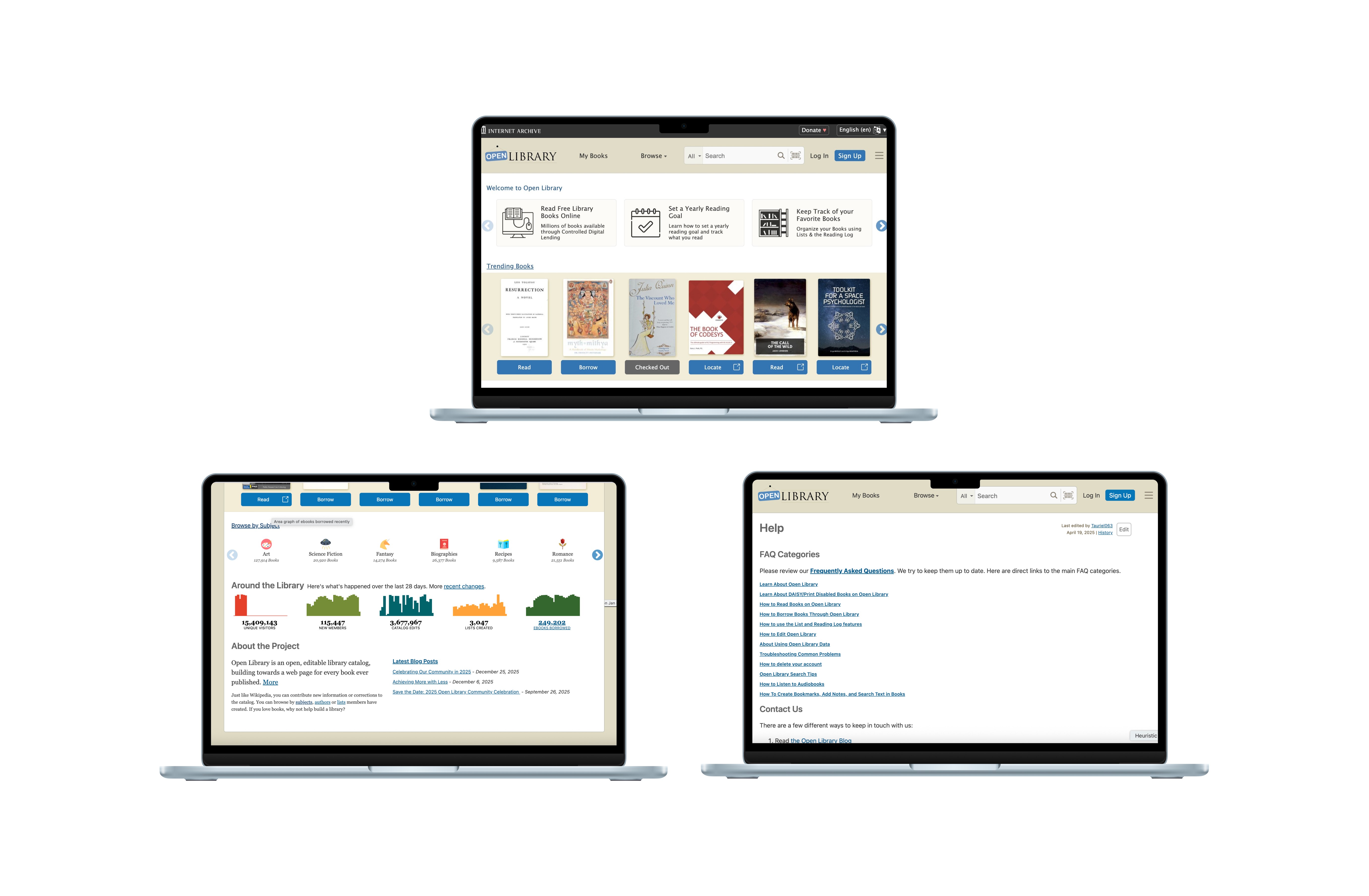
Current Design
The Problem
Problem #1: The system is outdated
Icons and symbols are not up to modern standards. Not scalable.
The Read, Locate, and Audiobook buttons use the same icon, which is visually confusing.
Problem #2: Inconsistency
Inconsistent icons
Colors are somewhat consistent but font sizes and links are not
Hamburger menu is present in desktop version, which is counterintuitive.
Some content placement are not uniform
Problem #3: Information overload
Not all elements on the screen (especially in the navbar) are necessary. It competes with and reduces the visibility of important content.
Some text are not legible and hard to scan
Using colours and links in a distracting way. Not purposeful or thoughtful.
Problem #4: Inaccessible help and documentation
FAQs and Help not prioritized and difficult to find
Design Process
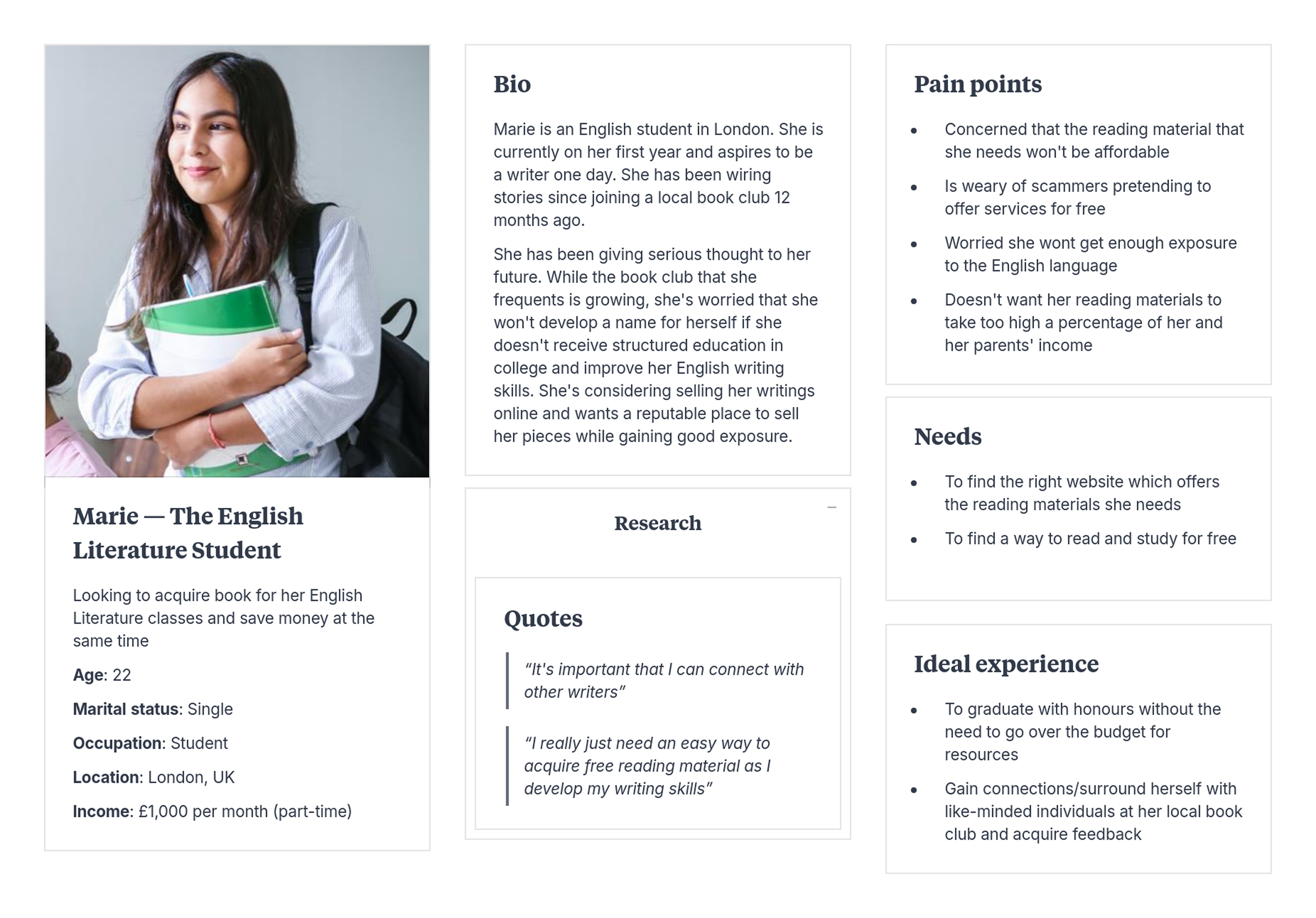
The User
Before I started redesigning, I first needed to identify who will be using the website and why. I mapped a summary of her story, her goals in life, and her current situation.
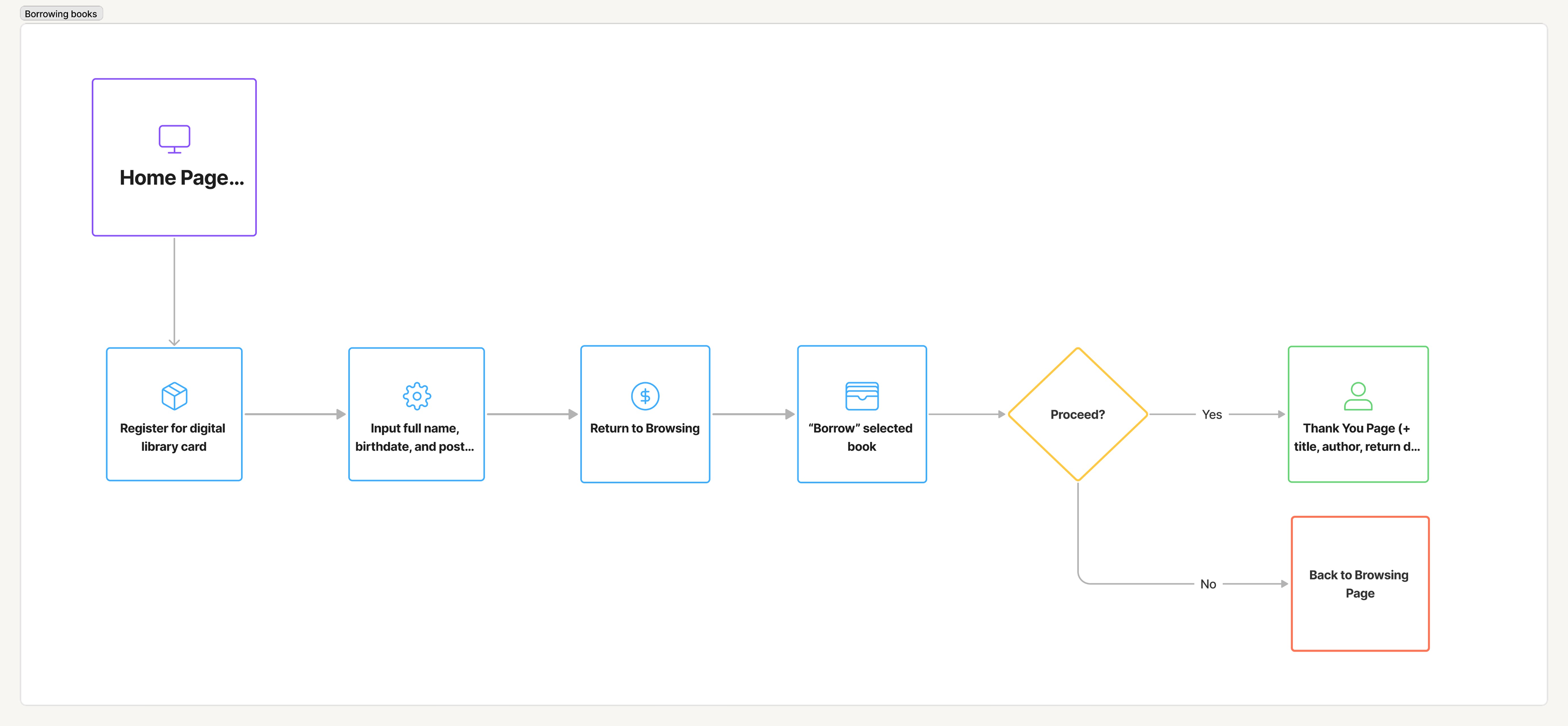
The User Flow
Next, I mapped her user journey, centered around her goal of borrowing a digital book, preferably for free.
Initial Designs
Now that I've established the who, why, and how, I began making rough sketches. My goal here is to establish the key features of the website and how many pages are required.
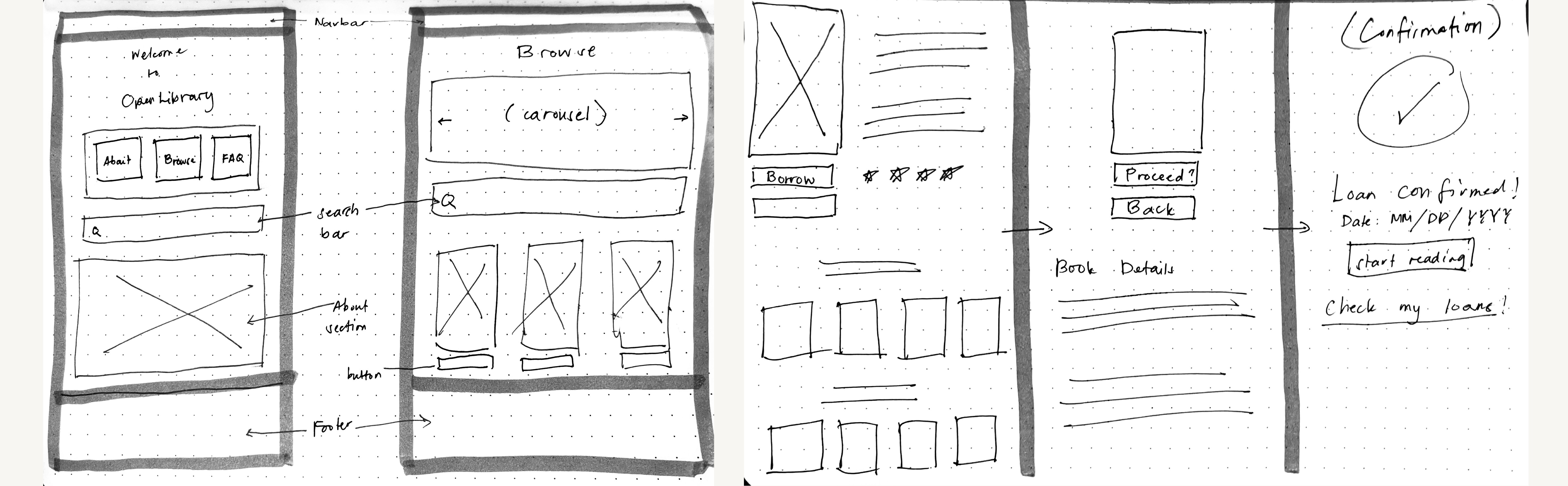
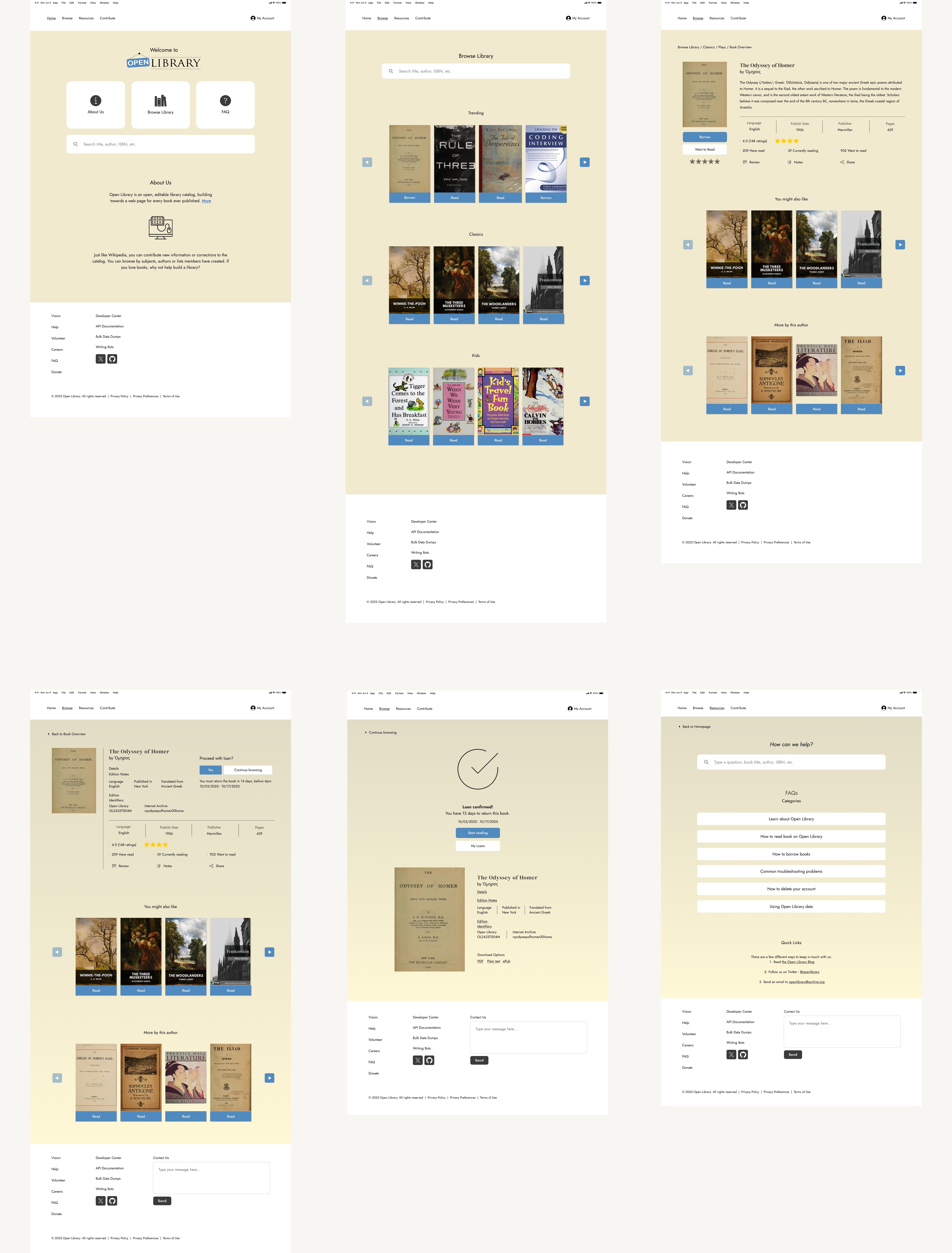
Next, I developed mid-fidelity wireframes based on the sketches above. I explored multiple iterations before refining and finalizing the examples shown here.
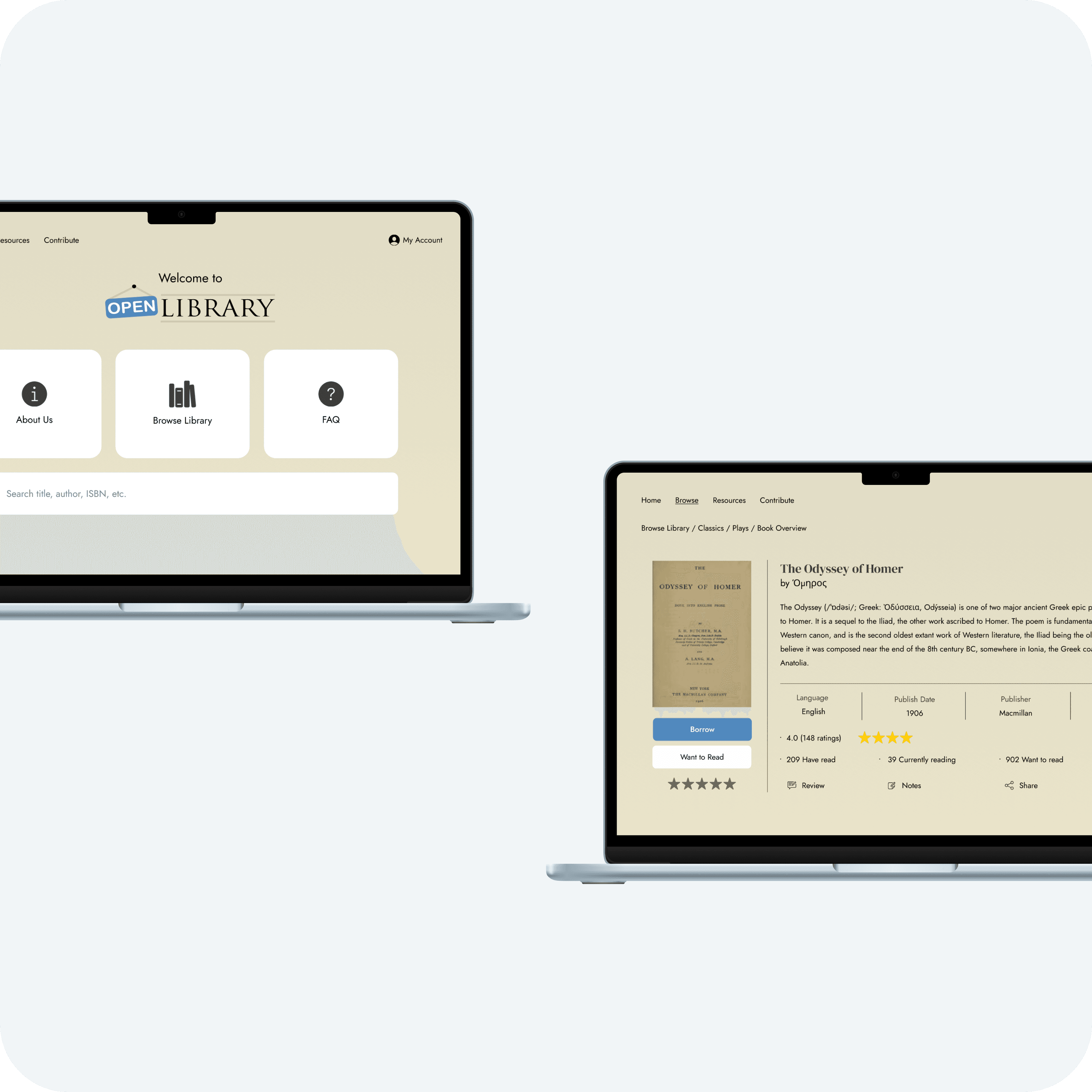
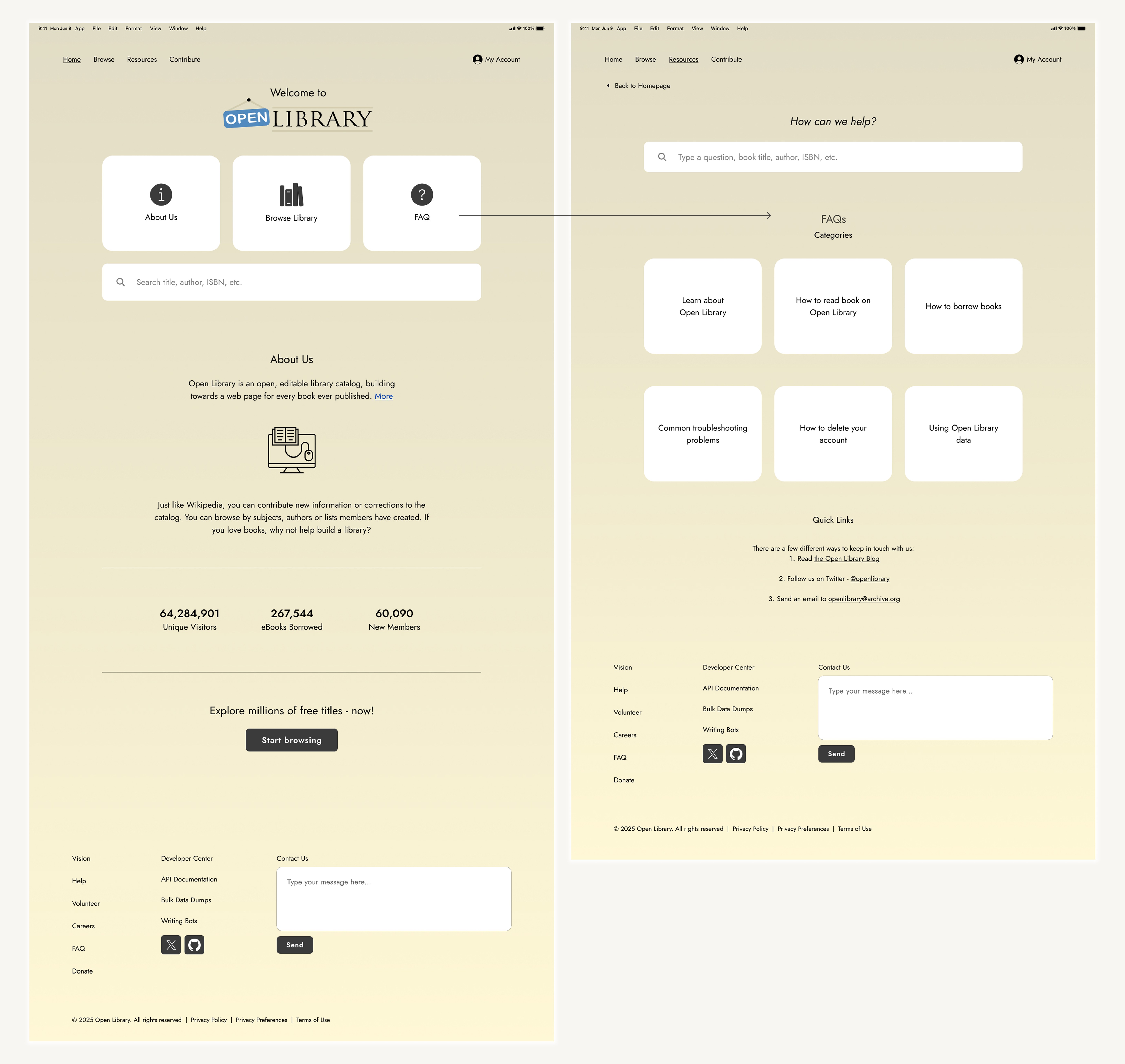
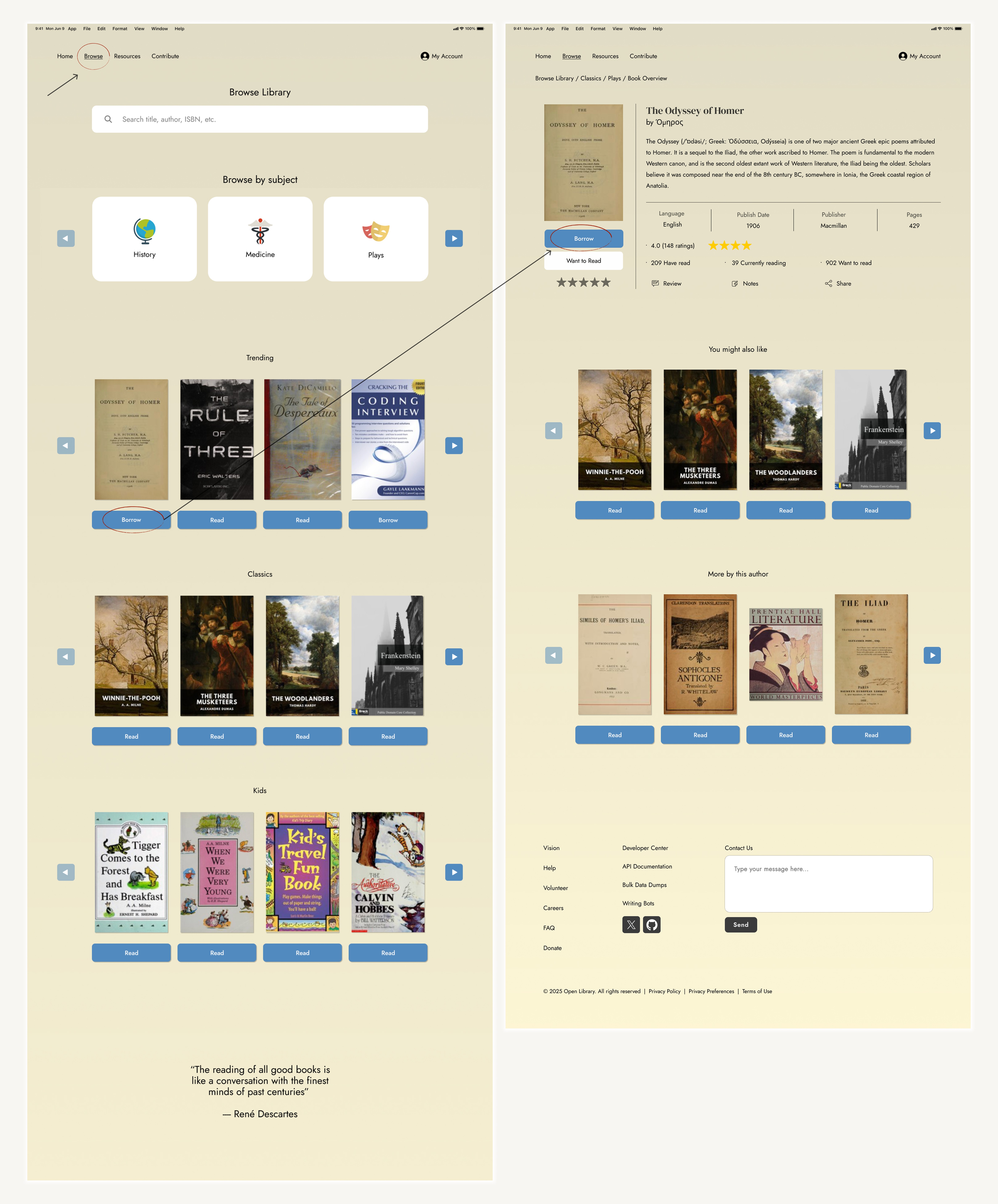
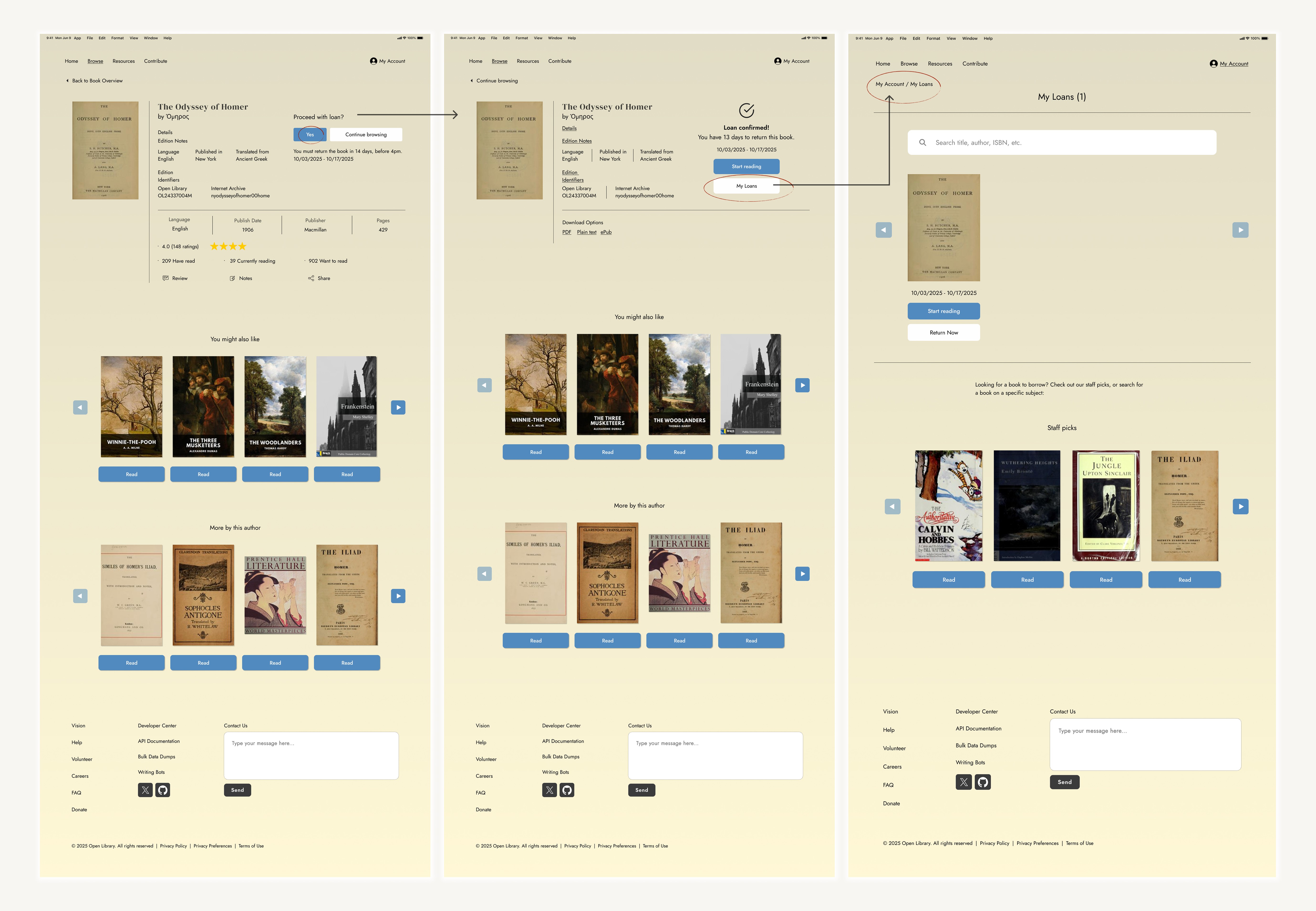
Final Design
Overall consistency and usability improved
Reduced cognitive load
Modern, standardized, and scalable iconography
Essential content such as FAQs can be easily located
Simplified book-loan process
Reflection
Constraints
A key constraint of this project was working within an established branding and design ecosystem. Redesign decisions needed to respect existing community contributions and legacies while still improving the user experience.
Rather than a full redesign, I focused on maintaining its current aesthetic, but more modernized, and meeting today’s technical standards.
Iteration
Blunders or mistakes are learning opportunities. As a matter of fact, I prefer them happening in the beginning stages. Catching these problems in low-fidelity stages prevents costly changes later in development.
This is why repeated iteration is so important as it gives you a better chance of catching these problems and growing as a designer.
"Skillfull pilots gain their reputation from storms and tempests" — Epictetus